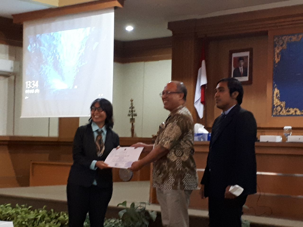
PMA's Logo has been Launched University General
The PMA Management currently represents a more simple and elegant spirit: professional,
transparent, and inspiring with the new logo. This logo was designed by I Gede
Cahya Adi Nugraha, a student in the Architecture Study Program, Batch 2020.
The logo refers to the basic shape of both square and rectangle, which symbolizes conformity, harmony, solidity, and equality. The four squares create the basic outline of a rhombus as a symbol of creativity in the spirit of togetherness. These squares use the primary colours: blue, yellow, red, and green. The blue has a meaning of self-confidence, professionalism, also dedication to science, humanity, and the home country. The red is the sense of passion and enthusiasm. The yellow one symbolizes happiness and optimism.
And green is often associated with nature. Green conveys the impression of being healthy and environmentally friendly. It aligns with the PMA's scientific vision: 'build up your sustainable built environment'. The study program's excellence fully supports the sustainable development concept and is explained in its curriculum.


UDAYANA UNIVERSITY